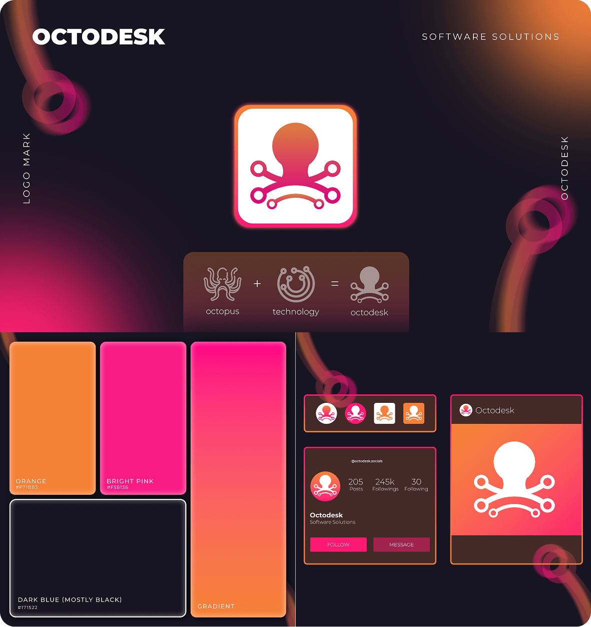
We worked closely with Octodesk to develop a brand identity that reflects both their multi-industry specialization and their cutting-edge technology solutions. Inspired by their name, which symbolizes adaptability, we designed a visual identity that incorporates dynamic elements and modern technology vibes. The goal was to create a brand that felt innovative, tech-forward, and versatile.
Our process included:
- Brand Strategy & Discovery:
We started by understanding Octodesk’s mission and their desire to position themselves as a multi-industry leader in tech development. The strategy was to create a brand identity that communicates their diverse capabilities while maintaining a strong focus on technology. - Visual Identity Design:
The logo needed to reflect the octopus concept, representing their ability to handle multiple industries. We developed a modern, clean logo with 8 dynamic elements that symbolize their ability to offer solutions across diverse sectors. To maintain a tech-forward feel, we incorporated gradient colors to evoke a sense of movement and progress. - Brand Guidelines:
We selected a gradient color palette with vibrant, active tones to give the brand an energetic, tech-savvy vibe. This color scheme was paired with sleek, modern typography to enhance the professional and innovative feel of the brand.