Dr. Maha Haroon

Empowering Movement, Restoring Health

Sector

Health, Physiotherapy

Timeframe

2 Months

Service

Brand Visual Identity Design

About

Dr. Maha is a certified physiotherapist based in Dubai, with years of experience in musculoskeletal therapy, post-surgical rehabilitation, and women’s health physiotherapy. After practicing for several years, she decided to take the next step in her career by starting her own physiotherapy practice. Dr. Maha wanted a brand identity that would resonate with her patients and convey her professional expertise, compassion, and commitment to improving their well-being.

Our Approaches

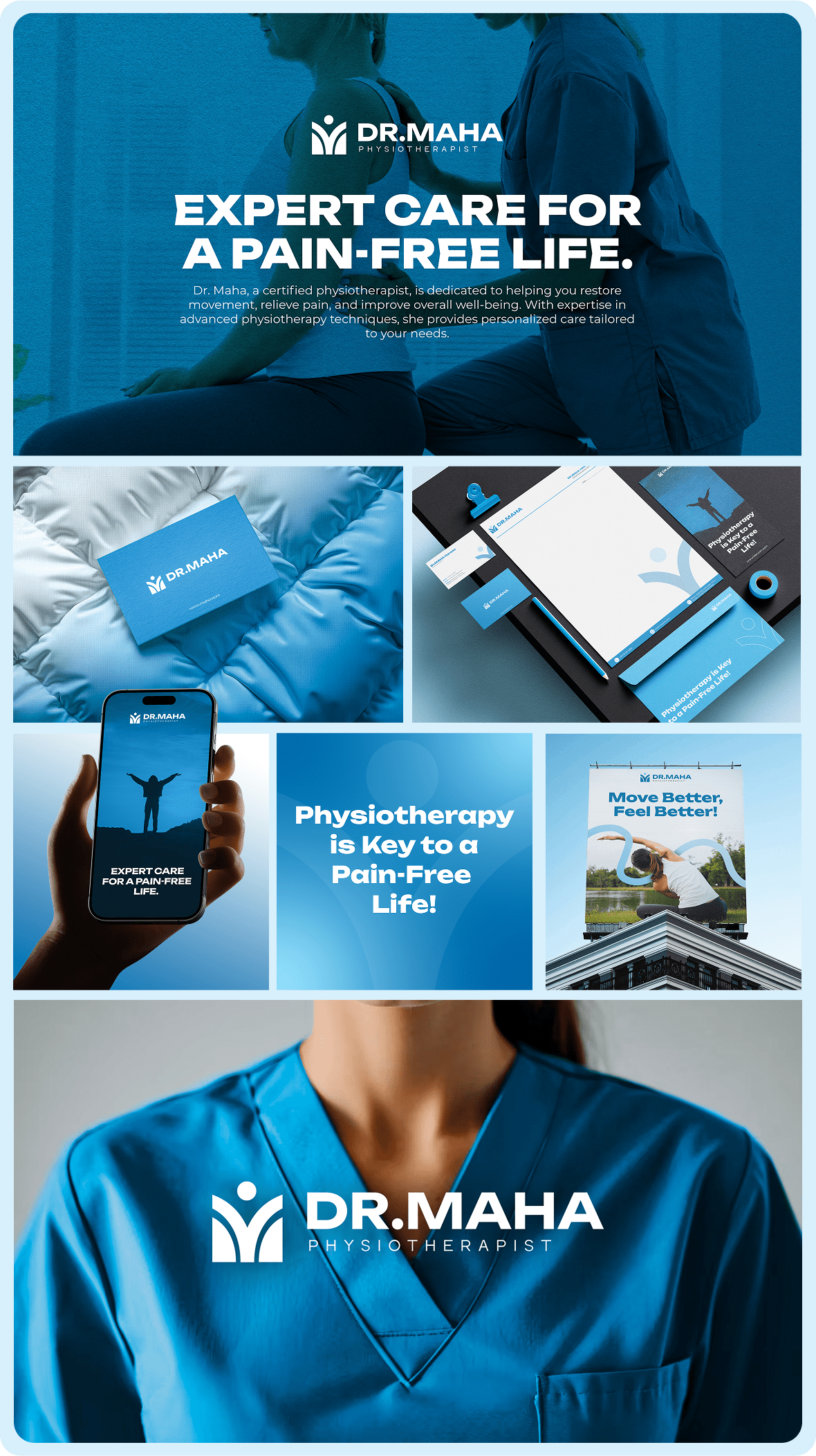
When Dr. Maha approached us for her brand development, we understood that her visual identity needed to reflect her professional expertise, her caring nature, and the trust she builds with her clients. Our approach was to create a modern, clean, and approachable brand that effectively communicated her vision.Our process included:

  1. Brand Strategy & Discovery:
    We began by diving deep into Dr. Maha’s vision for her practice, her core values, and how she wanted to connect with her clients. The goal was to develop a brand identity that would make her practice feel approachable, professional, and trustworthy.
  2. Logo Design & Visual Identity:
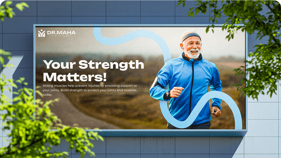
    The logo needed to reflect both Dr. Maha’s expertise and her personal, compassionate approach to physiotherapy. We crafted a simple yet elegant logo that conveyed movement, healing, and care — all key components of physiotherapy.
  3. Color Palette & typography:
    We selected calming, soothing colors that evoke a sense of health, balance, and relaxation, paired with modern typography to ensure the brand looked professional and approachable at the same time.

The Challenge

Dr. Maha wanted a brand identity that embodied both her professional expertise and her compassionate, patient-centered approach. The challenge was to design a visual identity that would stand out in a competitive healthcare market while also ensuring it resonated with her target audience—patients seeking both care and expert treatment.

The Solution

We created a complete visual rebrand for Dr. Maha that perfectly reflects her practice’s core values: professionalism, compassion, and expertise in physiotherapy.

  • Logo Design: The logo reflects the healing nature of physiotherapy, incorporating smooth curves and subtle motion elements to convey a sense of movement and restoration.
  • Color Palette & Typography: We chose soothing colors such as light blues and greens, paired with modern, sans-serif fonts, to represent the calming, healing experience Dr. Maha offers.
  • Brand Guidelines: A full set of brand guidelines ensures consistent use of the visual identity across all communication channels, from the website to patient materials and social media.

Let’s Build Your Brand Identity Together!

If you’re ready to bring your vision to life with a compassionate, impactful brand, we’re here to help you create something meaningful