Octodesk

Specialized Solutions, Powered by Innovation

Sector

Software Development

Timeframe

2 Weeks

Service

Visual Identity Design

About

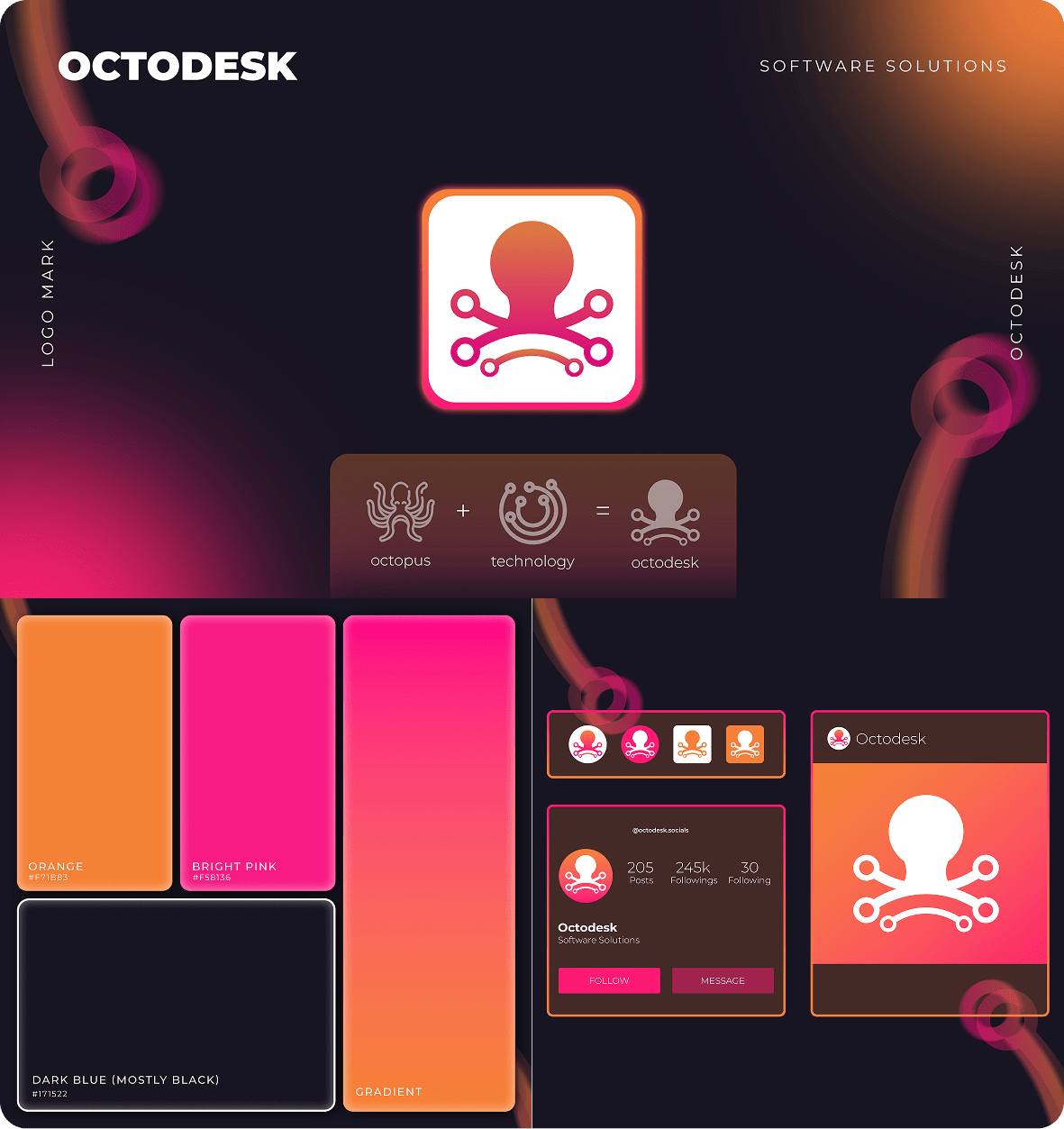
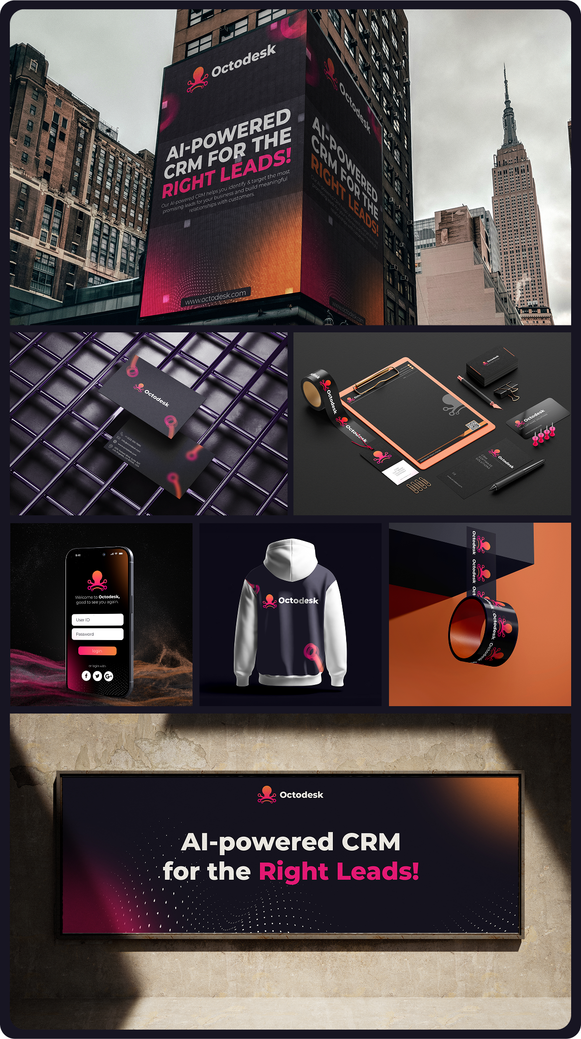
Octodesk is a software development company specializing in six key industries, including healthcare, finance, education, e-commerce, real estate, and technology solutions. The company’s name is inspired by the octopus, symbolizing their versatility and adaptability across these diverse industries. Their goal was to create a brand identity that would communicate both their specialized expertise and their innovative approach to providing tech solutions.

Our Approaches

We worked closely with Octodesk to develop a brand identity that reflects both their multi-industry specialization and their cutting-edge technology solutions. Inspired by their name, which symbolizes adaptability, we designed a visual identity that incorporates dynamic elements and modern technology vibes. The goal was to create a brand that felt innovative, tech-forward, and versatile.
Our process included:

  1. Brand Strategy & Discovery:
    We started by understanding Octodesk’s mission and their desire to position themselves as a multi-industry leader in tech development. The strategy was to create a brand identity that communicates their diverse capabilities while maintaining a strong focus on technology.
  2. Visual Identity Design:
    The logo needed to reflect the octopus concept, representing their ability to handle multiple industries. We developed a modern, clean logo with 8 dynamic elements that symbolize their ability to offer solutions across diverse sectors. To maintain a tech-forward feel, we incorporated gradient colors to evoke a sense of movement and progress.
  3. Brand Guidelines:
    We selected a gradient color palette with vibrant, active tones to give the brand an energetic, tech-savvy vibe. This color scheme was paired with sleek, modern typography to enhance the professional and innovative feel of the brand.

The Challenge

Octodesk needed a visual identity that would convey their expertise across six different industries while maintaining a unified technology-driven image. The challenge was to design a brand that could communicate both flexibility and innovation, while remaining consistent across diverse platforms and industries.

The Solution

We developed a complete visual identity that reflects Octodesk’s core values of adaptability and technological expertise:

  • Logo Design: A clean, modern logo with eight dynamic elements representing Octodesk’s industry versatility, symbolizing the octopus as a flexible, multi-functional entity.
  • Color Palette & Typography: The use of active gradient colors communicates energy, progress, and technology, paired with sleek, modern typography that reinforces their professional and innovative approach.
  • Brand Guidelines: We provided a set of brand guidelines to ensure the visual identity was applied consistently across all touchpoints, from digital platforms to print materials.

Let's Build Your Brand Identity Together!

If you’re ready to bring your vision to life with a compassionate, impactful brand, we’re here to help you create something meaningful